vevent
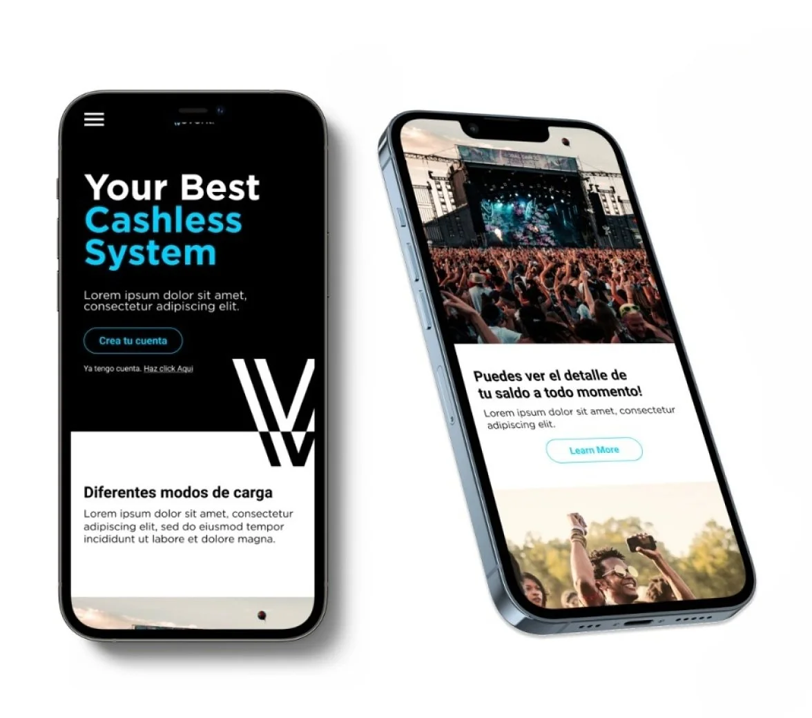
I designed Vevent, a user-friendly mobile app that facilitates cashless transactions at the Telmex venue in Guadalajara, Mexico. With a capacity of 10,000 seats, the app was tailored to customers who primarily used cash for payments.
Length of project: 6 months
Role: Sole UX Designer
Tools: Figma, Notion
Team: Developers, UI designer, graphic designer
context
In Mexico, 50% of the population has a bank account, and only 31% has a credit card. The use of cash is an important part of daily life. The biggest venue in the city of Guadalajara, Mexico has a capacity of 10,000 people offering mainly music events. At this venue, they have a huge volume of cash flow. With the new normal they wanted to create a system that could minimize the use of cash during events at the venue, having in mind that food and beverages are two of the most important income streams.
The metropolitan area of Guadalajara has:
5,268,642 population: 51% women, 49% man
94% have a cellular phone
67% have access to the internet
49% have a computer
Audience
50% of the population has a bank account
31% have a credit card
97% Use cash for purchases of 500 pesos and less
89% Use cash for purchases of 500 pesos and more
Since the audience is so diverse, depending on the music genre and event type, I segmented the users into frequent and occasional users. They were afraid to go back to events due to COVID-19 and use cash since it seemed unsafe.
PROBLEM STATEMENT
How might I design a user experience where, when visiting the venue and buying food and drinks, people can pay without cash in an easy and fast way?
Discovery
Users were segmented in:
Frequent users
The majority are seniors
They often go and buy the event tickets at the venue, which often includes traveling long distances to buy, due to a low level of technological knowledge
They represent 12.6 % (based on a survey conducted in April 2021)
The majority use credit or debit cards to pay
They tend to avoid long lineups to buy products
They are concerned to attend the venue because of covid
They are very familiar with the building; they have good orientation inside the building
Occasional users
Users find it difficult to orient themselves inside the building, they walk long distances to find their seats or selling points
Waiting a long period of time in lineups to buy food and beverages which causes a lot of stress
They represent 72.5 % ((based on a survey conducted in April 2021)
They are between 30 to 45 years old
Since the use of cash is the main way of paying in Mexico, there is a very well-known convenience store, called Oxxo, where people can pay with cash services or digital products that people in other countries would pay with credit card or debit card.
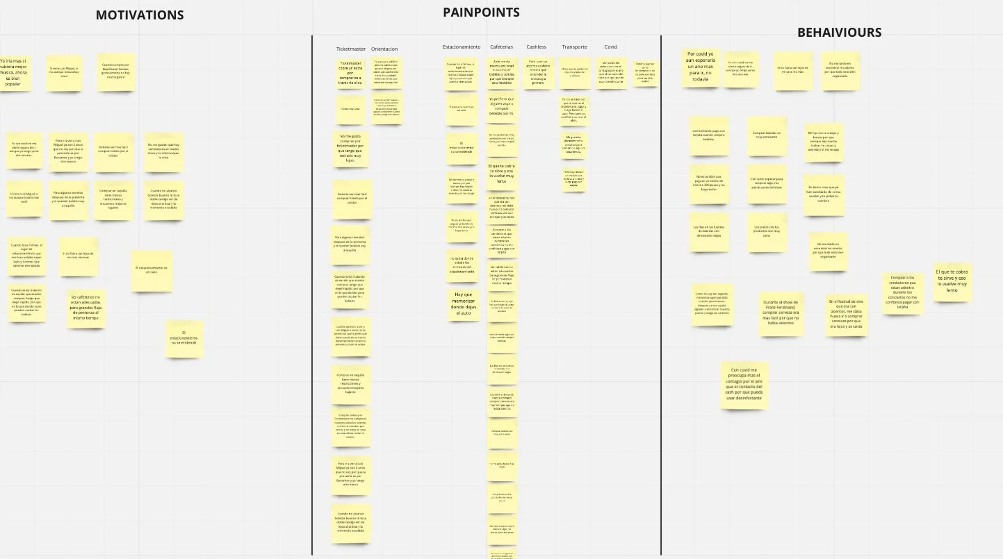
DEFINE
Affinity Diagram
Considering the research insights and the two types of users with different pain points, I focused first on how to solve the problem of using cash inside the venue. Secondly, I worked on how to reduce long lineups when buying food and beverages and how to easily be oriented inside the building
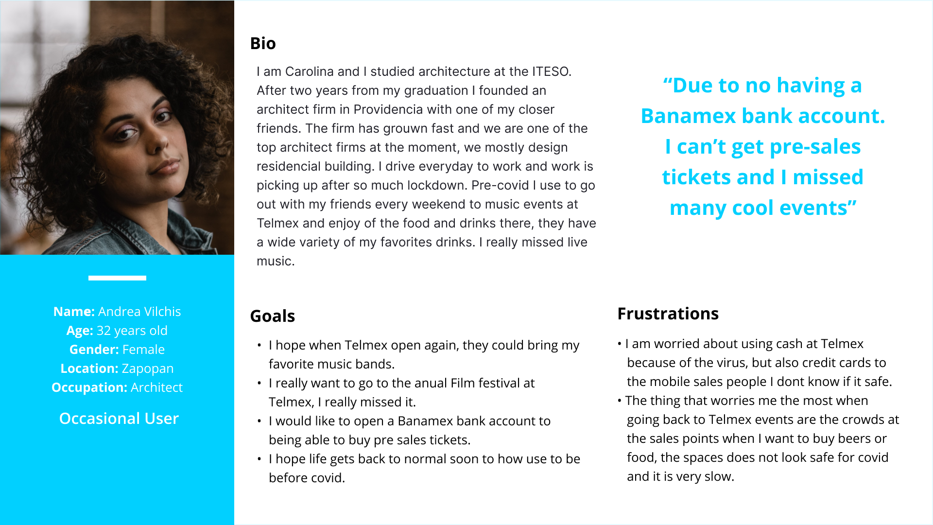
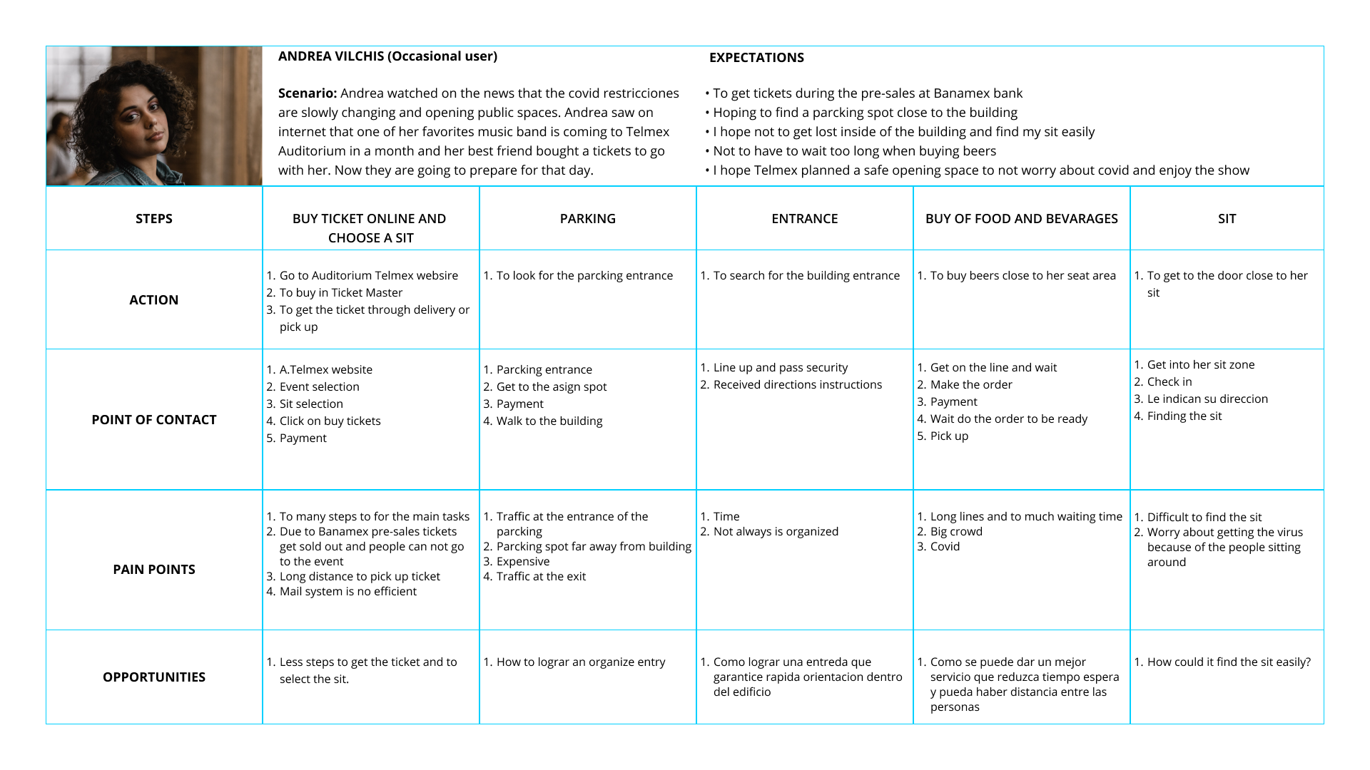
USER EXPERIENCE MAP
When creating the user experience map I considered:
The participants’ steps when planning and attending the venue
I decided to use the most relevant actions
I defined what the persona sees, thinks, and feels while they search for the safest route.
IDEATION
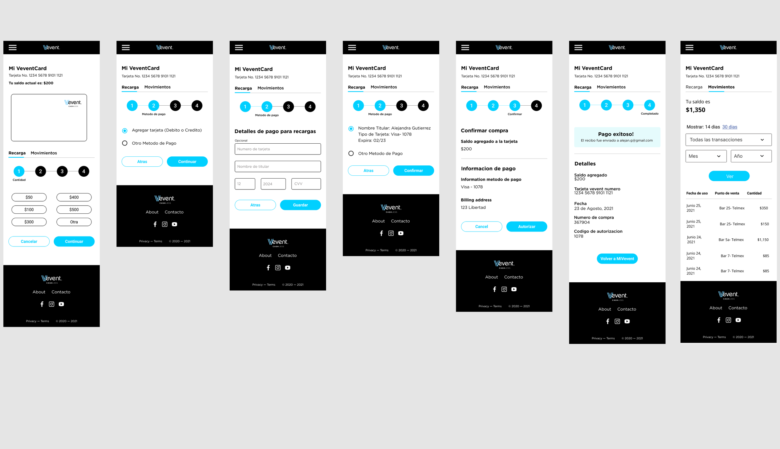
After defining the users, and creating personas and user experience maps, I came up with the first sketches where the user can use two main tasks, which are, adding value to the registered card and reviewing their transactions.
In the first round of ideation, I proposed "Create account", “Register card”, “ Add value” and “ Transactions” for the MVP.
First, the user needs to purchase the physical card in any convenience store (it will come with a serial number)
Go to the “vevent” website and register the card with the serial number.
After everything is set up the user can add value online or with cash at the convenience store.
The user will attend the venue with a cashless card ready to pay for food and beverages.
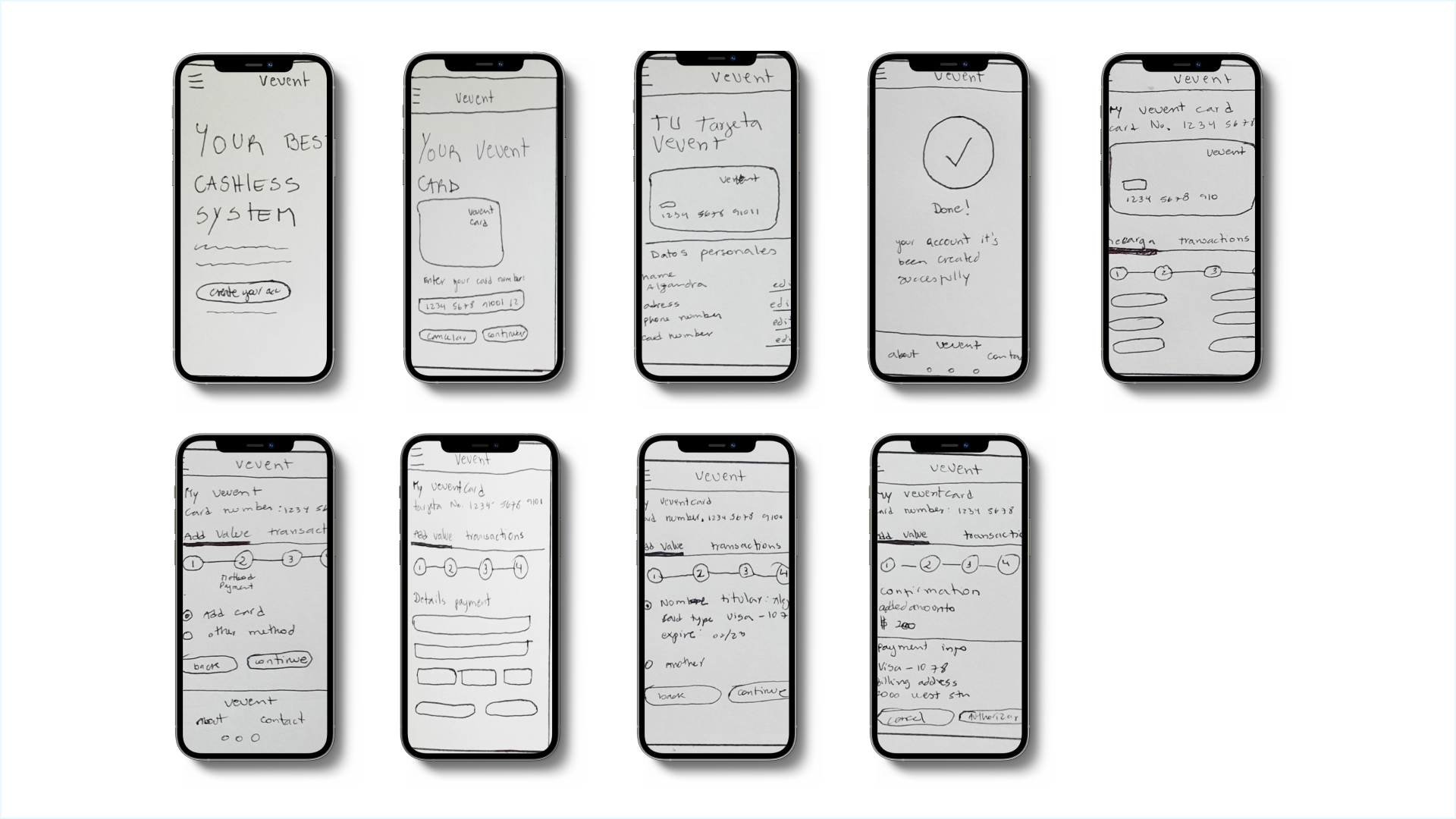
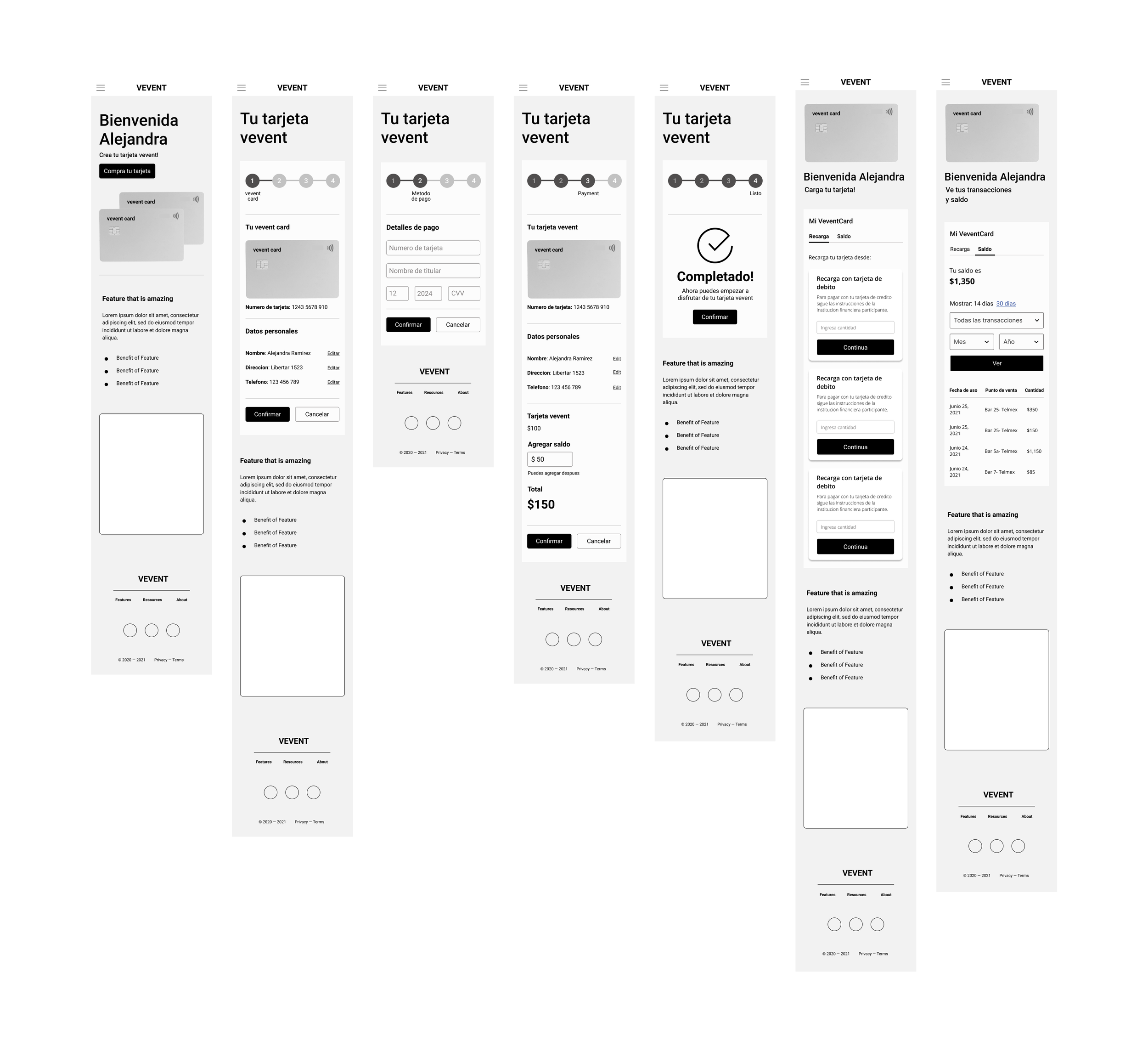
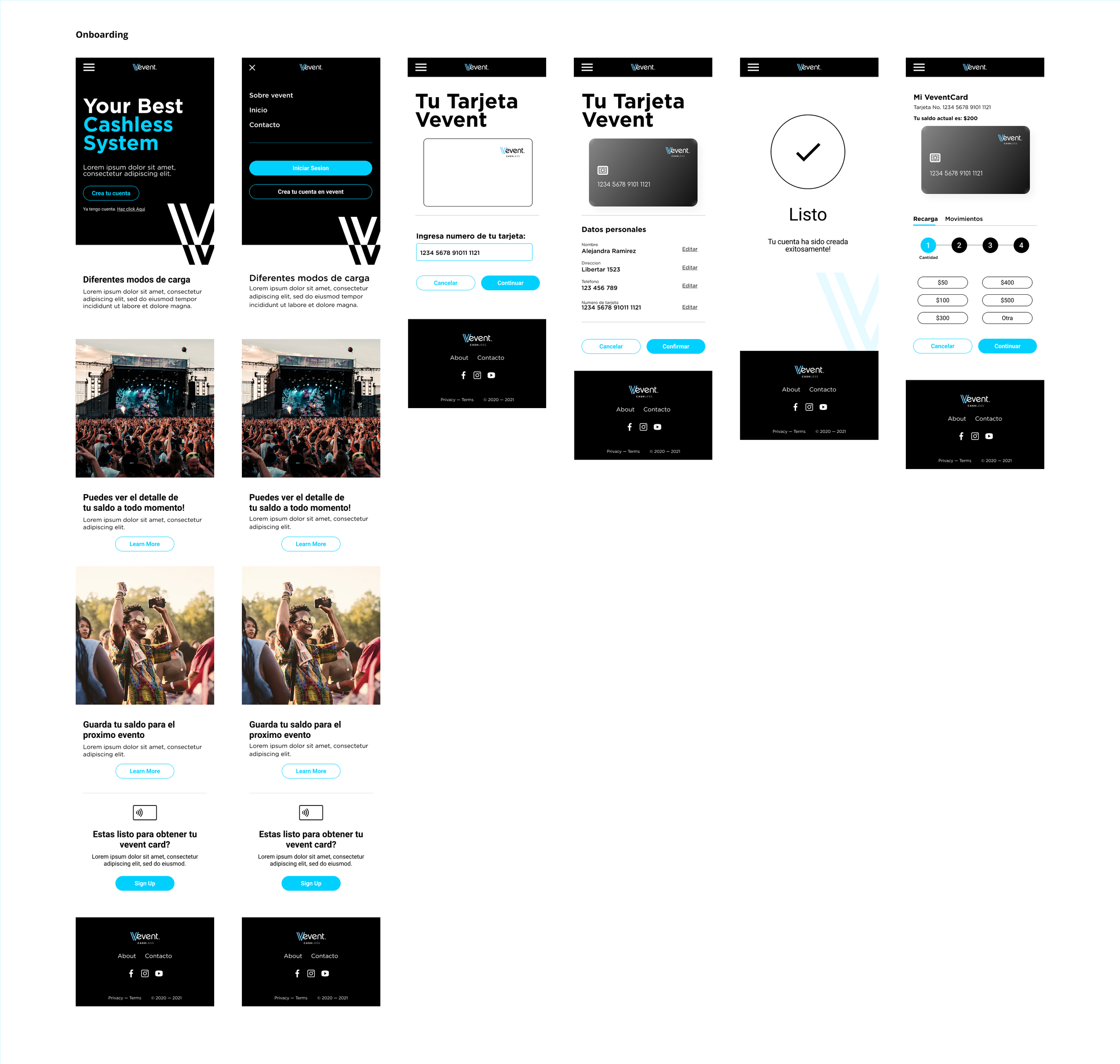
MID-FIDELITY WIREFRAMES
After the first round of testing, I decided to create a progress bar to reduce user uncertainty and ensure that the app is working and making progress.
Landing page
2. Create an account
3. Sign up
4. Register card number
5. Personal information confirmation
6. Payment Information
7. Payment information confirmation
8. Complete
LEARNINGS
When doing the research, I recognized a big opportunity in Mexico and other developing countries to create a system that can reduce the use of cash in closed spaces.
For this project, the starting point was to create an MVP for the Telmex Auditorium in Guadalajara Mexico but the idea is to continue solving the main problems that the user experiences when visiting this venue such as the use of cash, problems with orientation inside the building for the occasional user, to add the parking payment to the cashless system, among others.